Overview
🔍
The Scenario
In South Africa, the experience of on-street parking can turn stressful quickly. Finding an open parking spot seems easy, but returning to your car often involves dealing with informal 'car guards' soliciting money. What should have been a simple process turns into a potentially awkward encounter, disrupting the usual in-and-out routine.
⚠️
The Problem
How can we enhance on-street parking in South Africa, ensuring a safer and smoother experience for all?
Self-proclaimed 'car guards' in South Africa are unreliable, often intoxicated, and offer minimal theft protection. Their presence poses safety risks, especially for solo female drivers at night, raising concerns about reliability. This unique issue in South Africa remains unexplored.
💡
The Solution
After multiple iterations and user testing sessions, the idea of creating an app-based platform, for mobile devices, that connects drivers directly to on-street parking guards was chosen. This ultimately makes the process of on-street parking in South Africa much more convenient and safer for everyone.
Details
🎨 Design Process
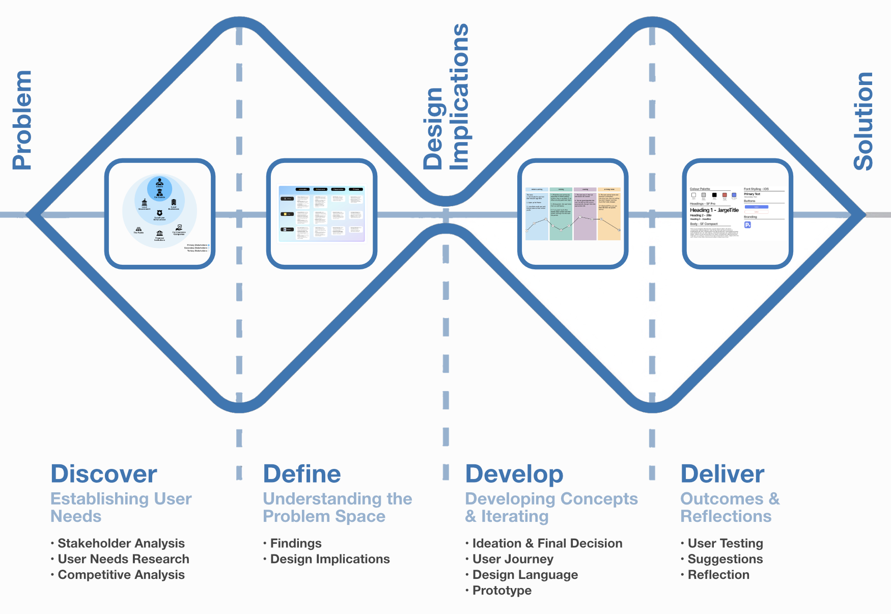
The project can be divided into four main areas based on the double-diamond design process. The following graphic gives an overview of the steps and tasks involved in each one.
🕵🏼♂️ Discover
Stakeholder Analysis
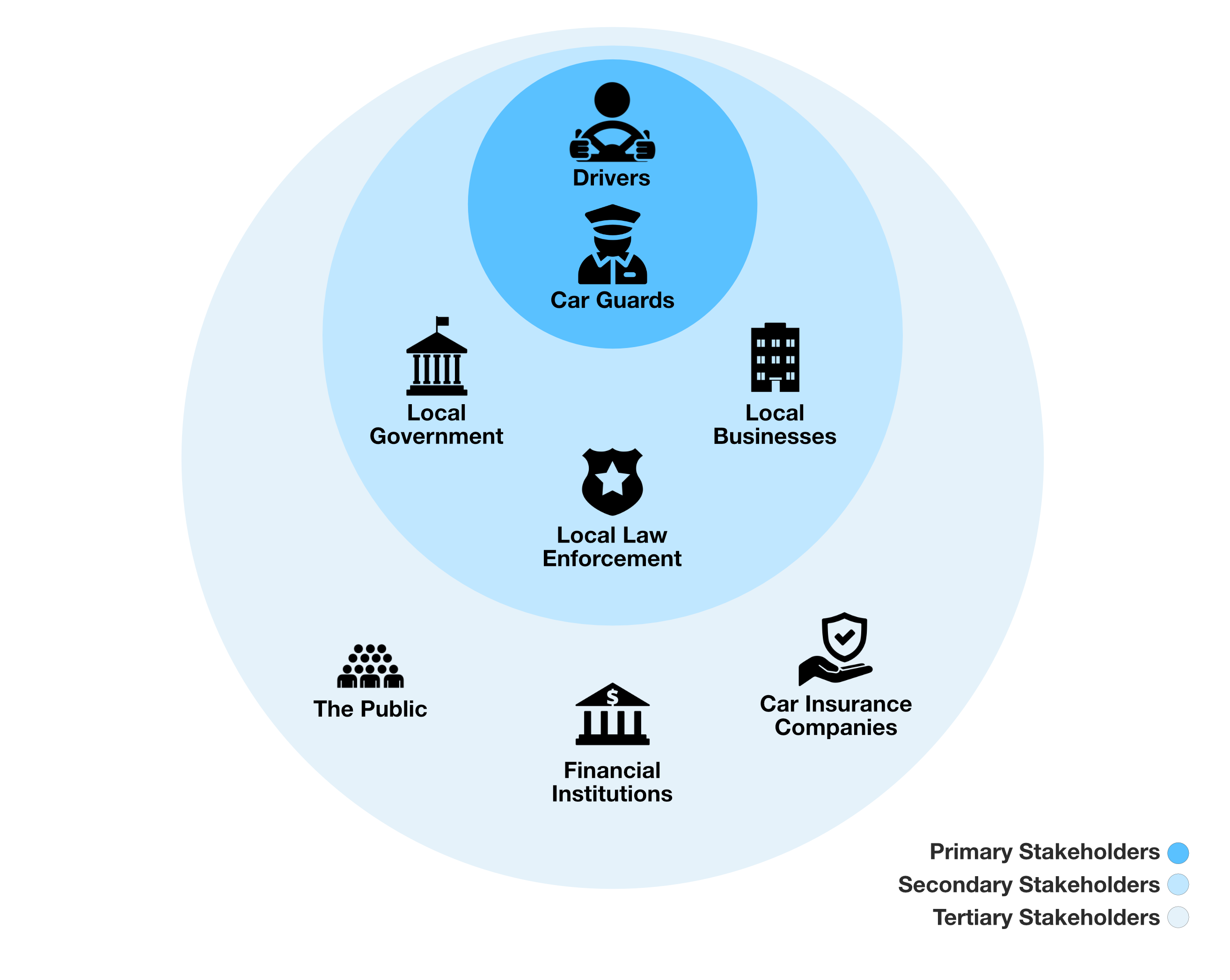
An illustrated account of all the stakeholders, and their relationship to one another, can be seen here. In this case, two main stakeholders were identified:
- Drivers: The primary target user of the app, seeking a safer and more convenient on-street parking experience
- On-Street Car Guards: Those who use the app to connect with drivers, providing their services and receiving compensation in a more organized and transparent manner.
User Needs Research
To enhance the on-street parking experience in South Africa, I conducted comprehensive user research, including surveys and semi-structured interviews. The surveys involved 42 participants from diverse backgrounds, and were done to uncover prevalent issues with on-street parking, particularly concerning informal 'car guards.' Key questions explored safety concerns, guard reliability, and overall parking experiences. Findings are discussed in the subsequent section.
Recognizing the limitations of surveys, I complemented the research with 4 in-depth semi-structured interviews, which included frequent and solo female drivers. These interviews revealed nuanced emotional and experiential aspects of the on-street parking scenario, detailed further in the findings section.
Competitive Analysis
After looking through the research data, which focused on the on-street parking experiences in general, I performed a competitive analysis of other parking services and systems in South Africa. While I considered looking at similair international services, I decided that given the cultural differences that it would not be worthwhile. All of this then resulted in three competitors being identified in the space at the time: two off-street parking services, KaChing and Admyt; and one on-street parking service, ParkFind.
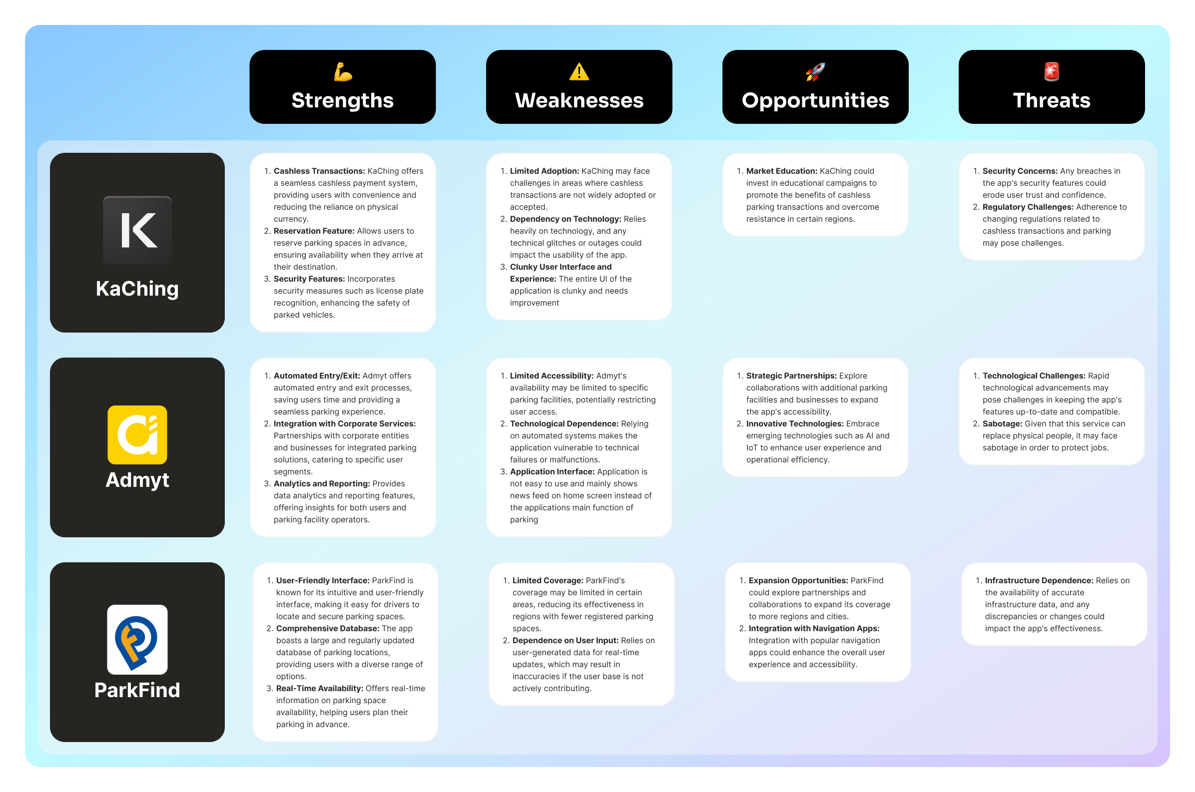
Having performed a SWOT (Strengths, Weaknesses, Oppurtunities, Threats) analysis of these competitors, the following information was noted:
- None of the existing parking apps or services have gained traction in South Africa.
- The primary issue with existing systems is that they added complexity rather than simplified the parking process.
- Although off-street parking solutions like KaChing and Admyt promote 'ticketless entry', they frequently face issues with malfunctioning AI cameras, forcing users to revert to traditional ticket systems.
- ParkFind, designed to modernize parking meters, falls short by transferring existing parking meter complexities, such as choosing parking duration and limited hours, to a mobile application.
- Overall, the competitive landscape highlights significant opportunities for innovation and improvement in the on-street parking sector in South Africa.
🎯 Define
Findings
1
Participants expressed increased safety concerns due to unpredictable informal 'car guards’
2
Participants doubted the car guards' effectiveness in genuinely preventing car theft
3
Participants often reported 'car guards' as intoxicated or unreliable, casting doubt on their ability to provide protection
4
Participants characterized the current situation as a routine process turned stressful
5
Participants worried about carrying cash for tipping, feeling pressured to give money to avoid confrontations
6
Female drivers emphasized increased vulnerability when unexpectedly confronted by 'car guards
From the research performed, there is clearly a pressing need for innovation in the on-street parking landscape in South Africa. Users crave a solution that not only ensures safety and reliability but also addresses the emotional impact of the current system. The integration of a cashless transaction system, enhanced safety measures, and a user-friendly interface emerged as key priorities for improving the on-street parking experience in South Africa.
Design Requirements
Through these findings, three high-level design requirements were developed to ensure high relevance to the goal that is trying to be achieved:
- The solution should provide a sense of safety to the user, knowing who is looking after their car at all times
- Users should be able to rely on a digital payment method, alleviating cash and the potential unknown cost of parking
- Parking guards should have appropriate training and skills, making sure that they are a reliable guard for your car
🛠️ Develop
Ideation & Final Decision
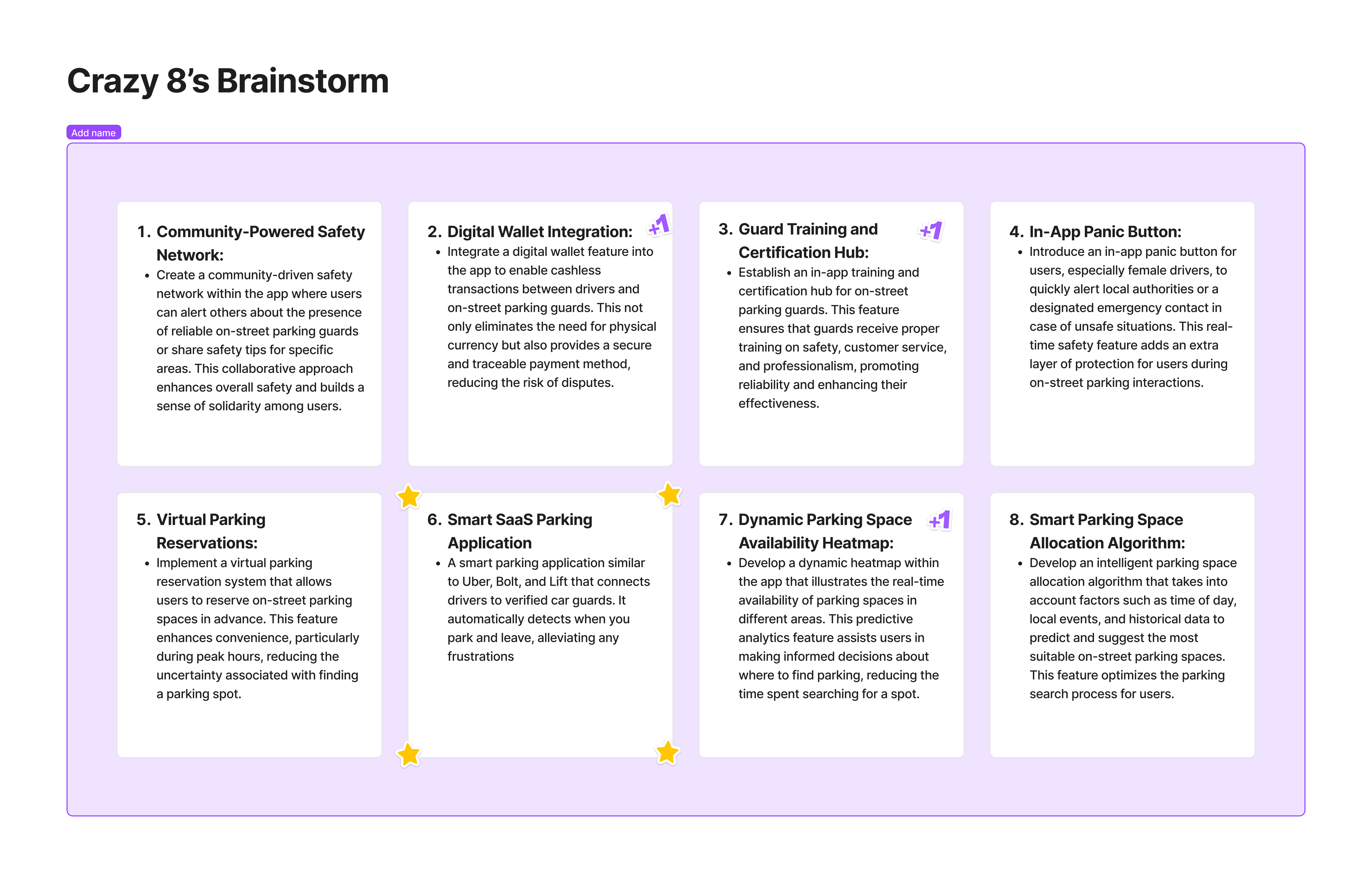
Based on the research and design requirements listed, I then performed a brainstorming session on FigJam to develop potential solutions to this problem - which can be seen below. Thereafter, I went through each idea and tried to combine, and filter them into the best ones. From this, I ultimately landed on the idea of creating a SaaS application that connects drivers to verified on-street car guards.
User Journey
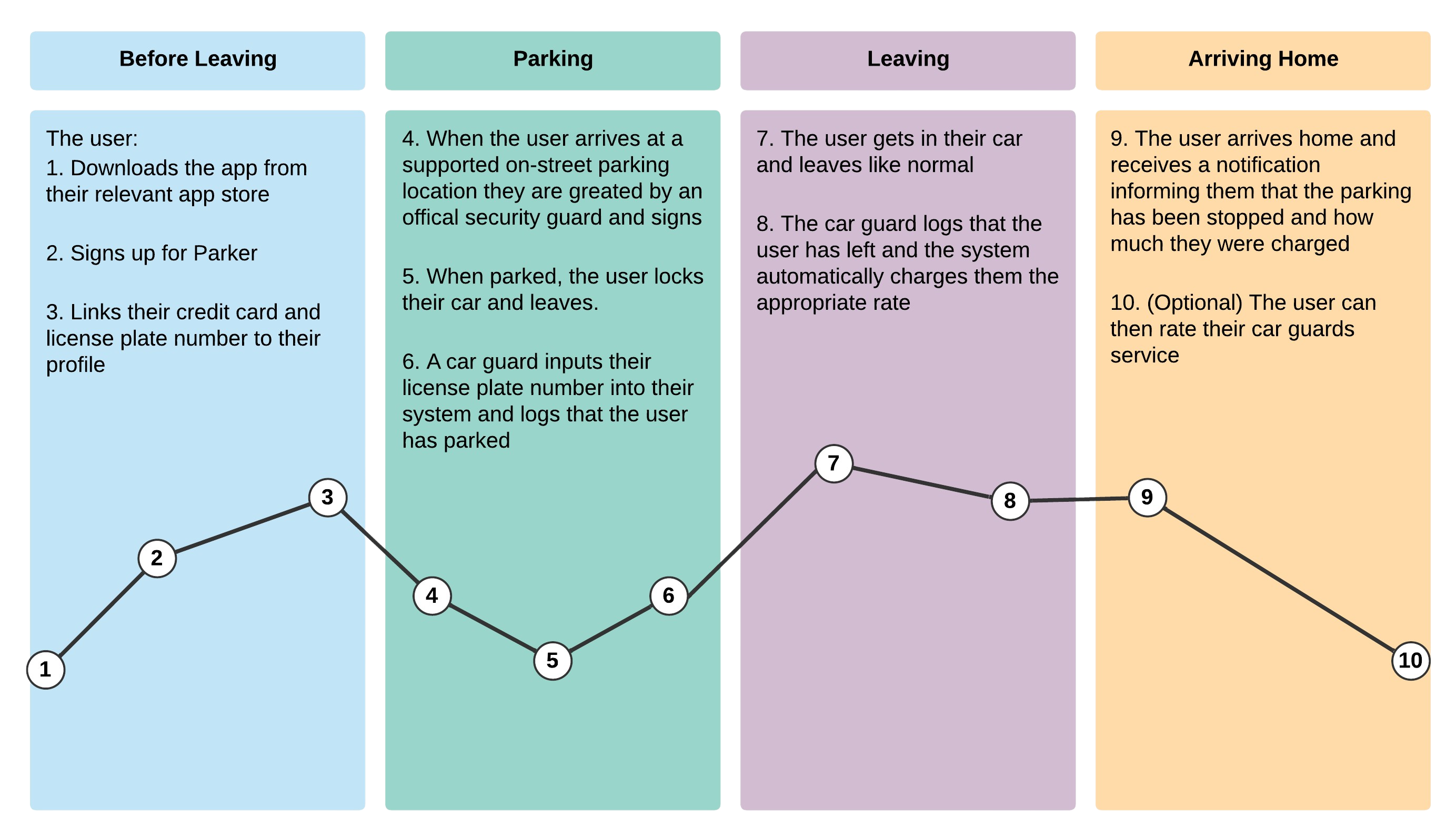
With a design solution chosen, I then went on to develop a standard user journey for the driver in order to better understand how a user might use the application and how it should function.
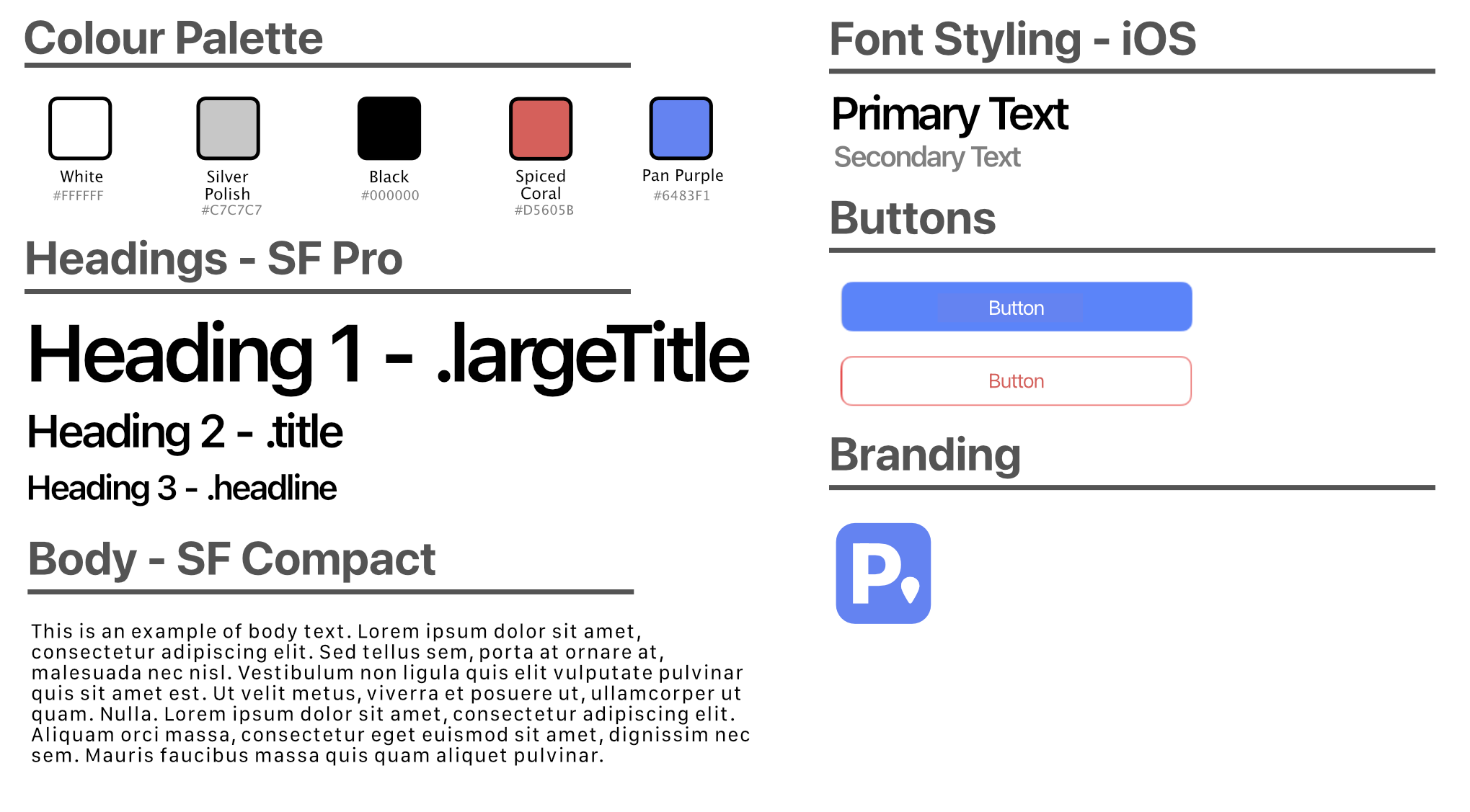
Design Language
Thereafter, I went on to create a design language for the application - ensuring its style is minimalist and easy to understand.
Low-Fidelity Wireframes
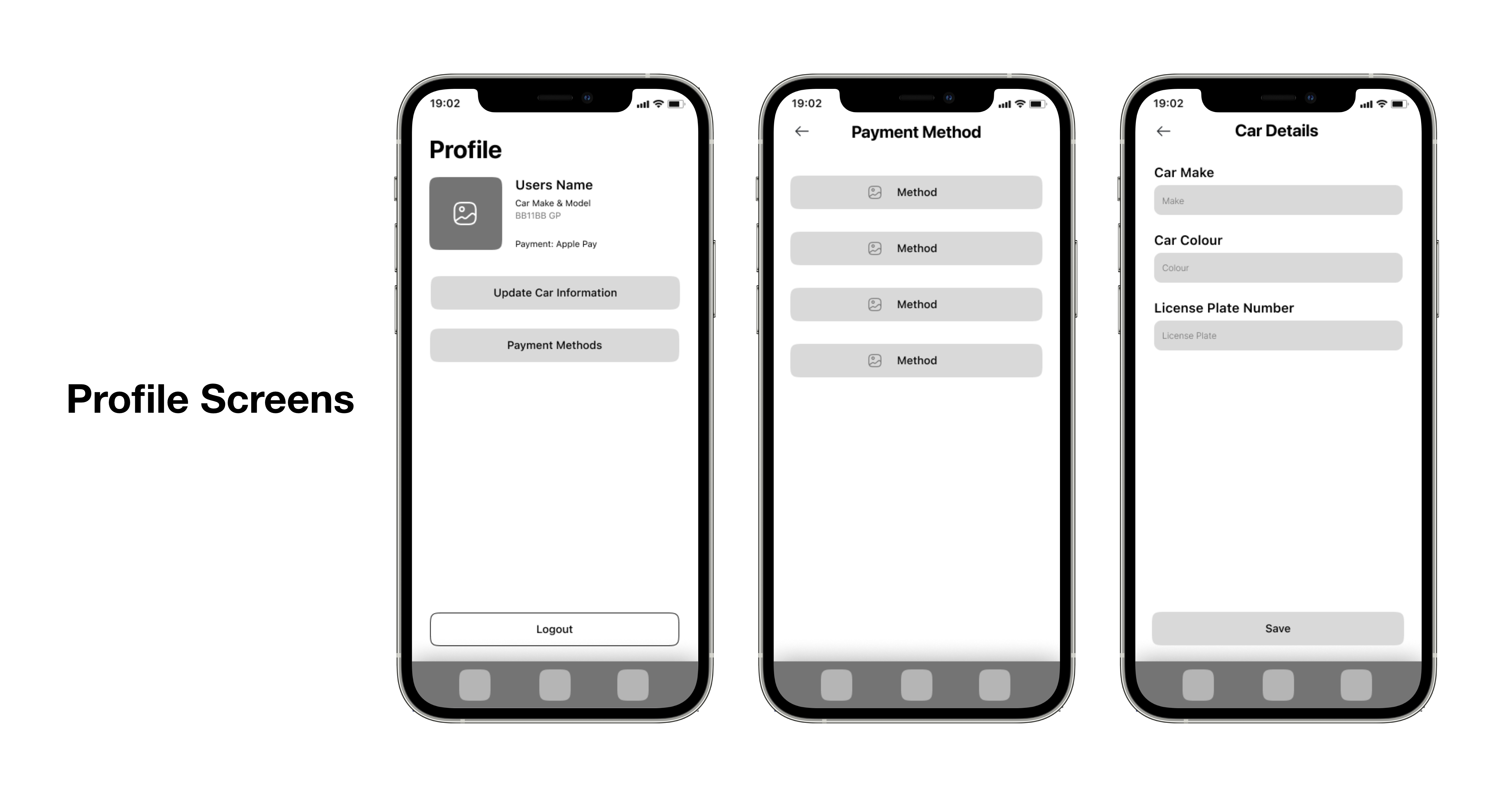
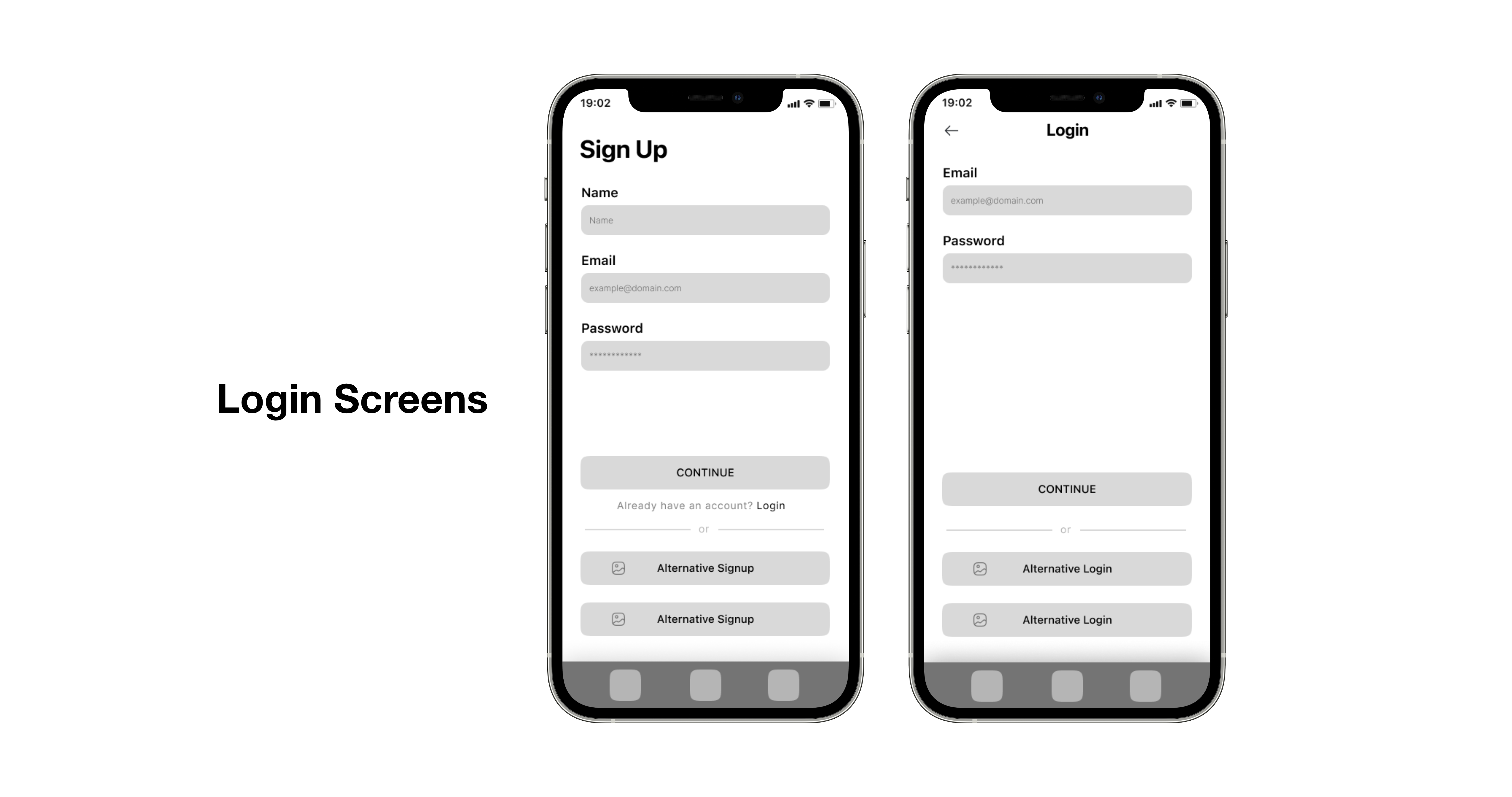
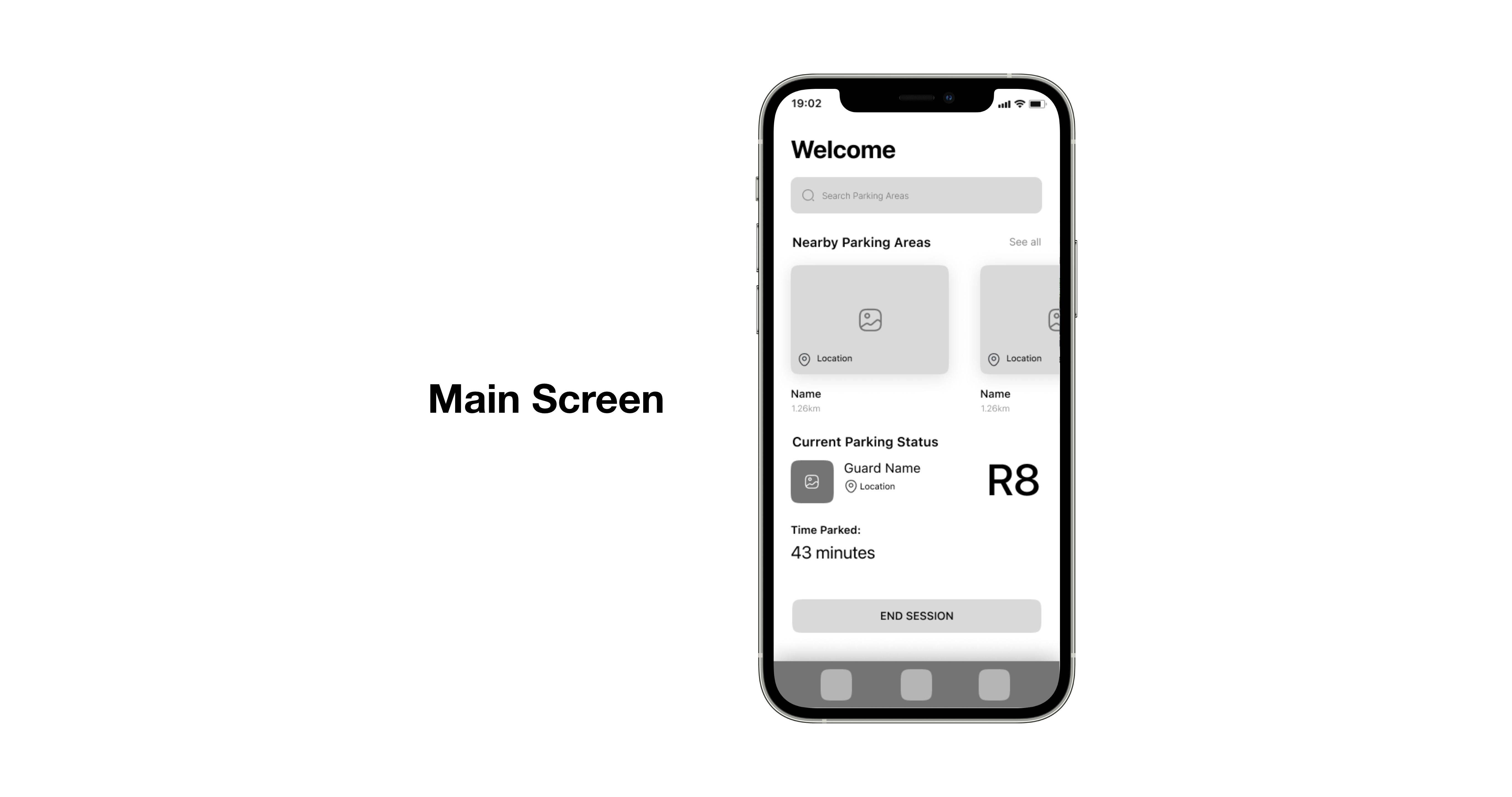
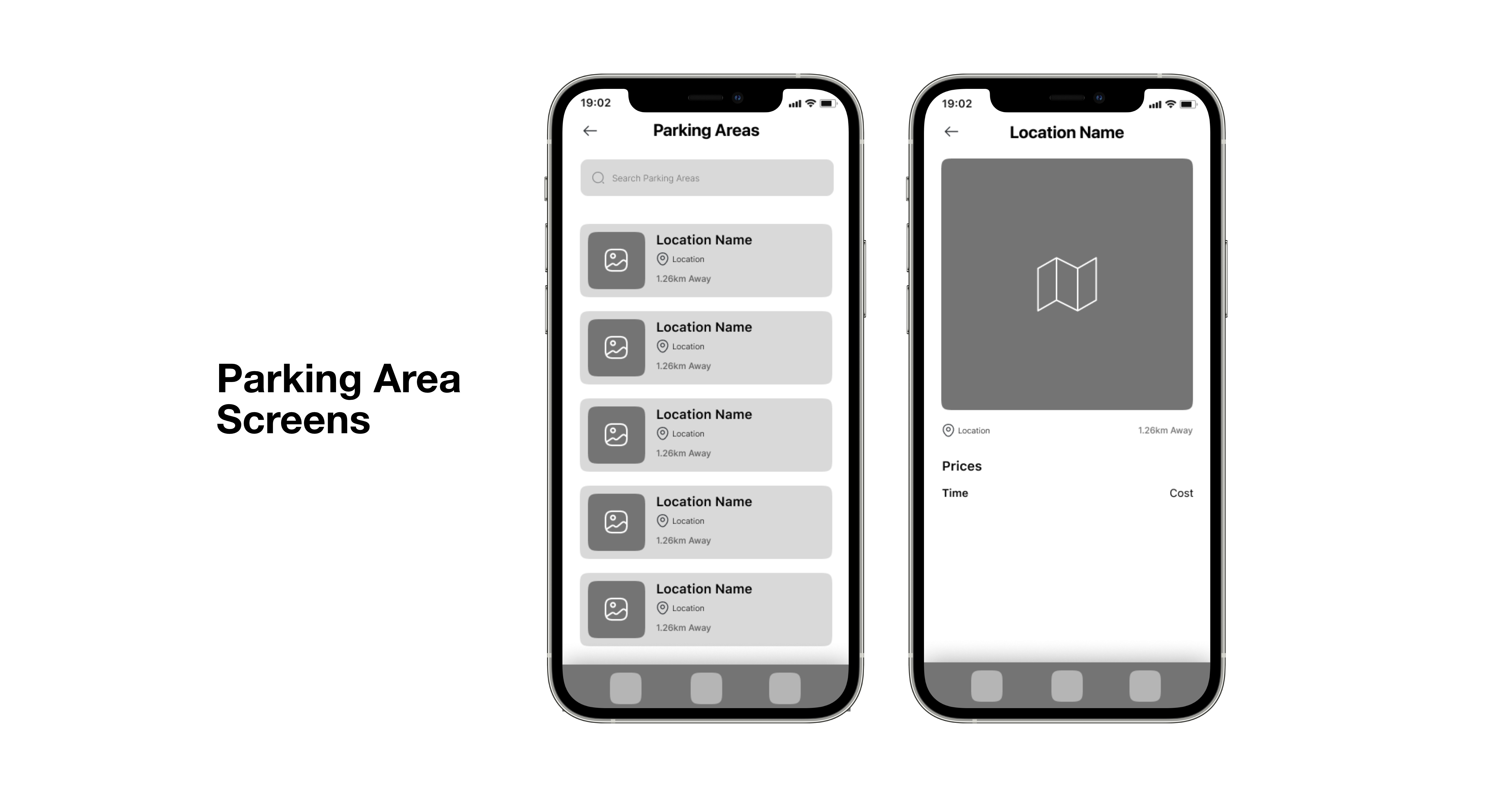
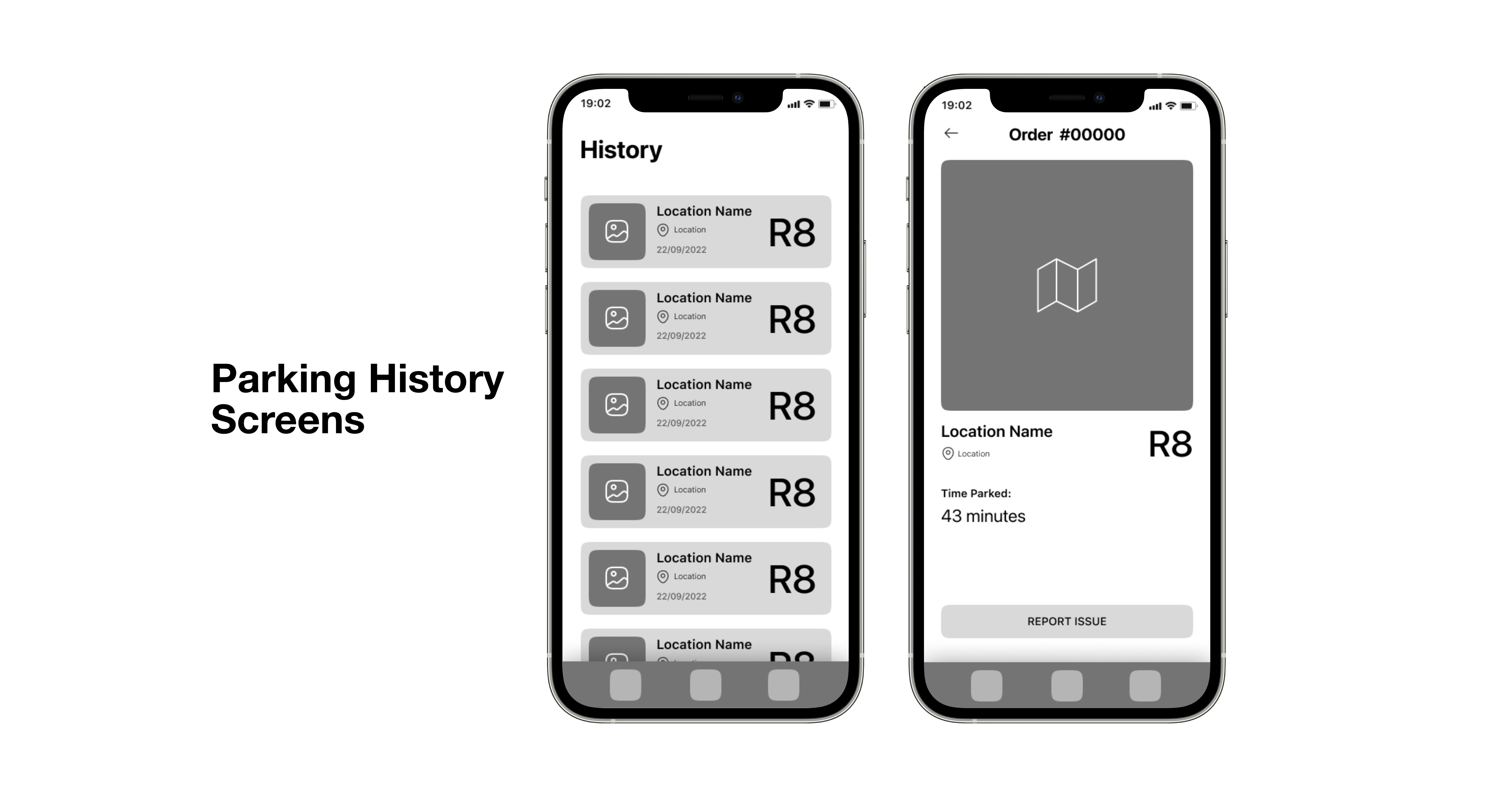
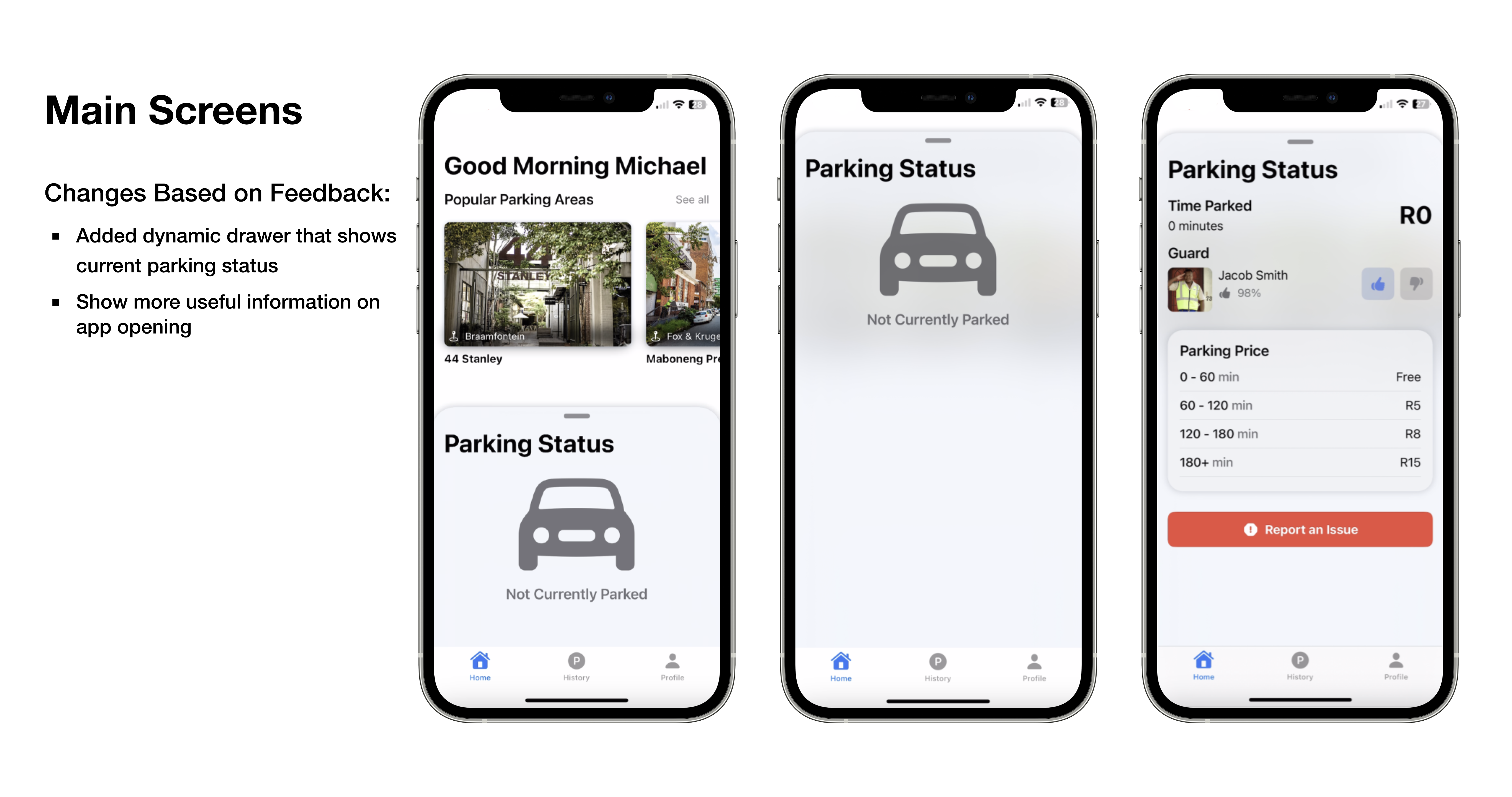
Using Figma, I then developed a series of low-fidelity wireframes for the driver application. It is important to note that like other SaaS applications, Parker requires a customer (the driver) and provider (the car guard) applications, but for the sake of scope this project focuses solely on the customer side.
High-Fidelity Wireframes
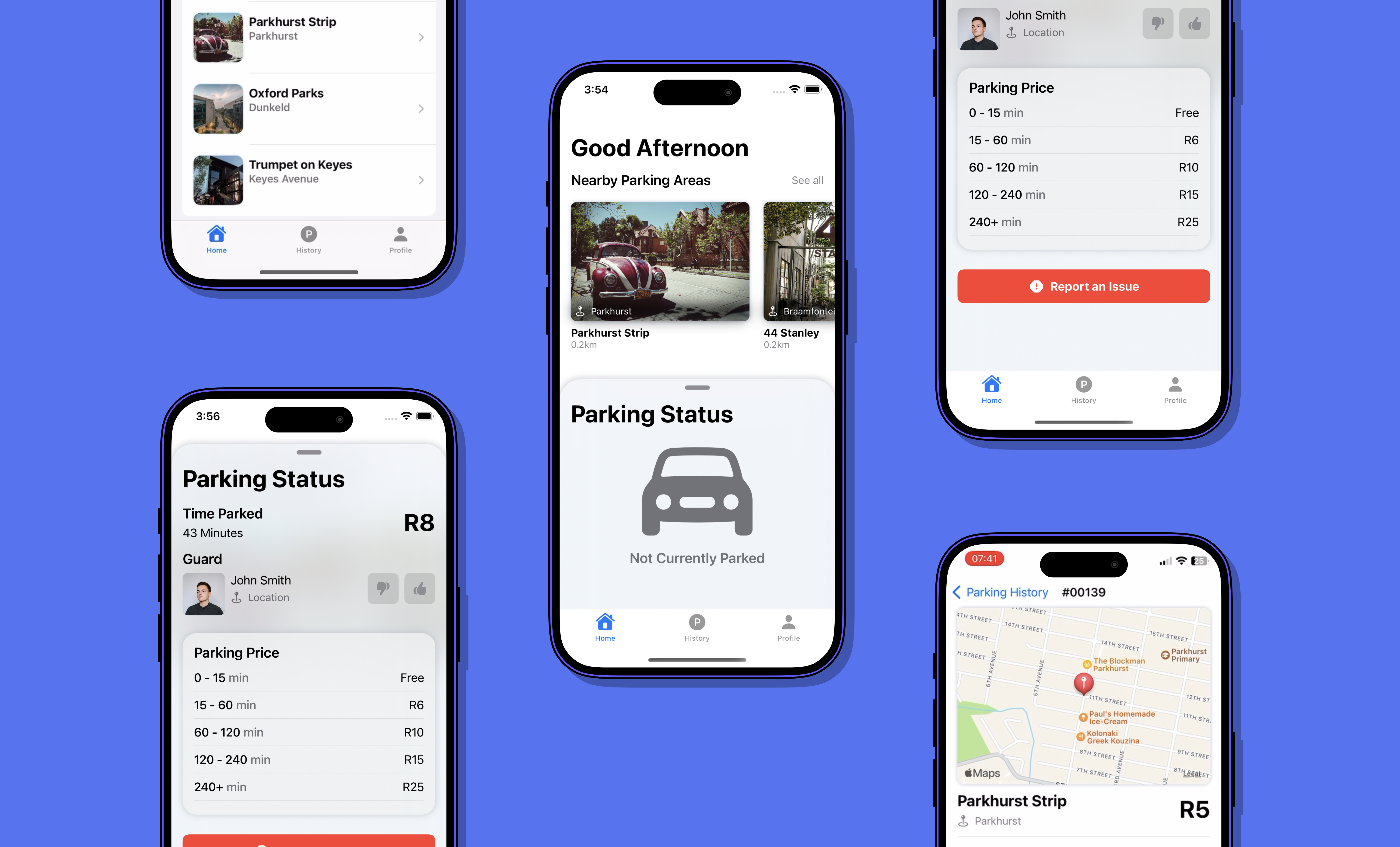
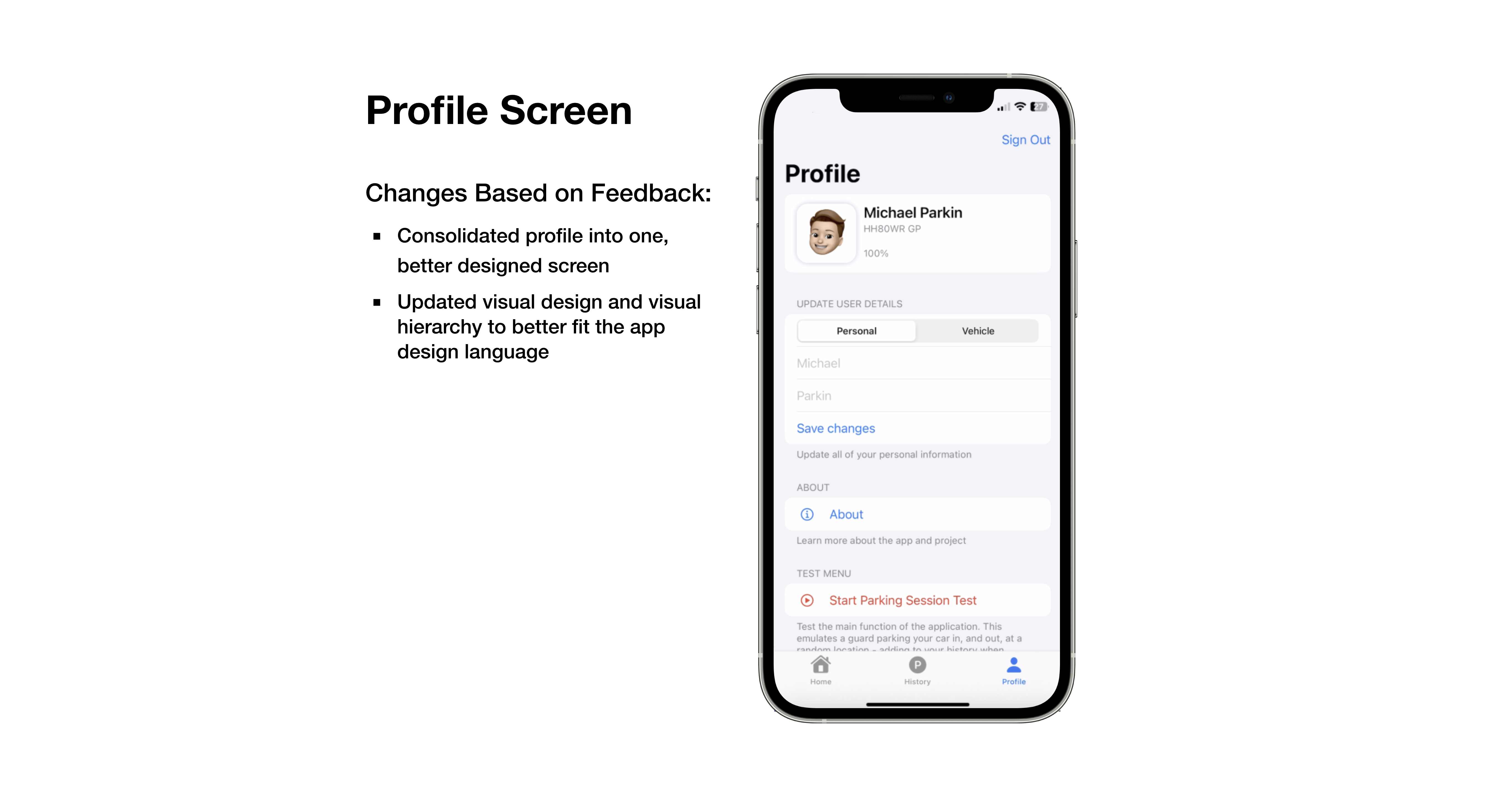
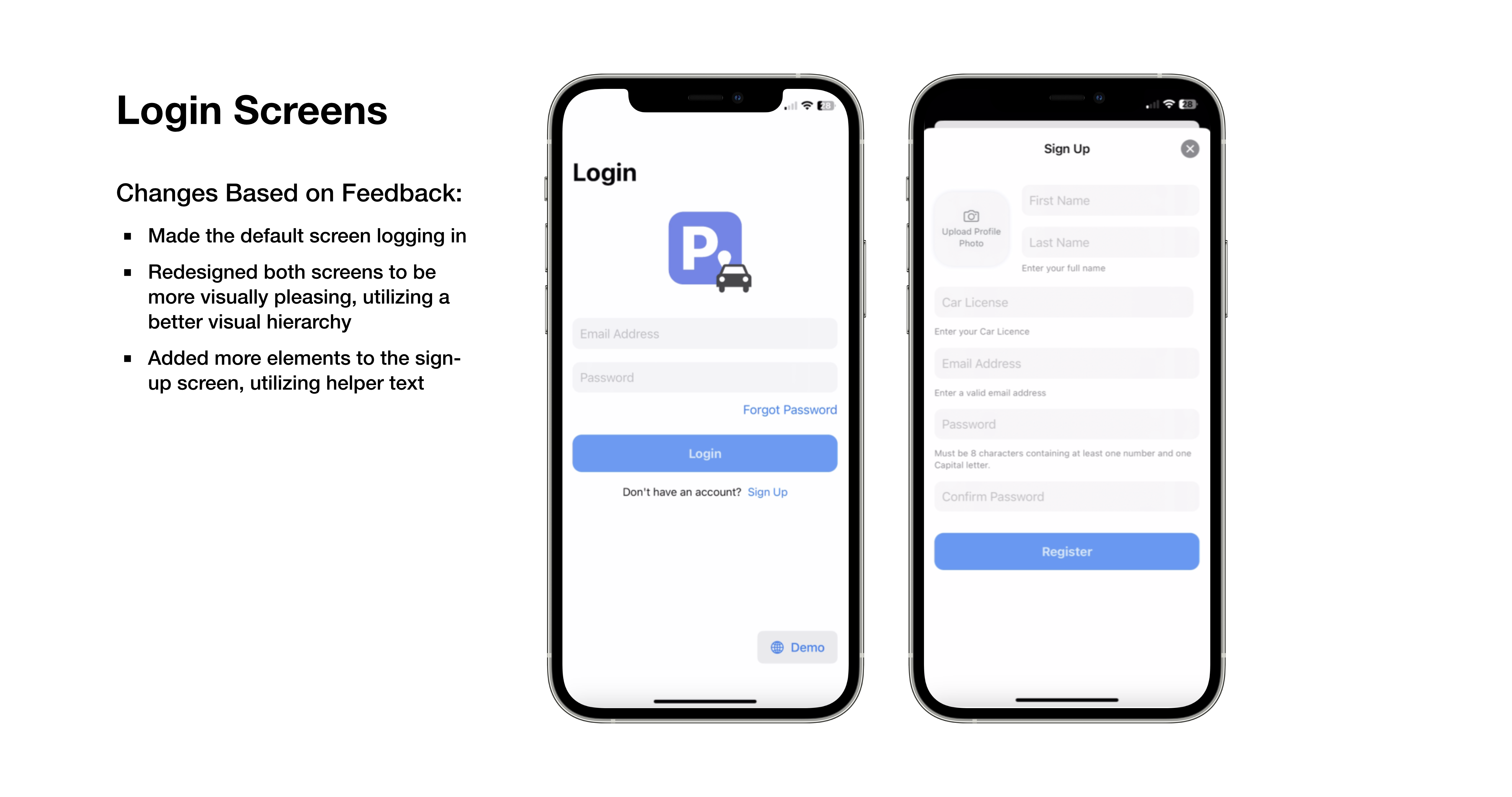
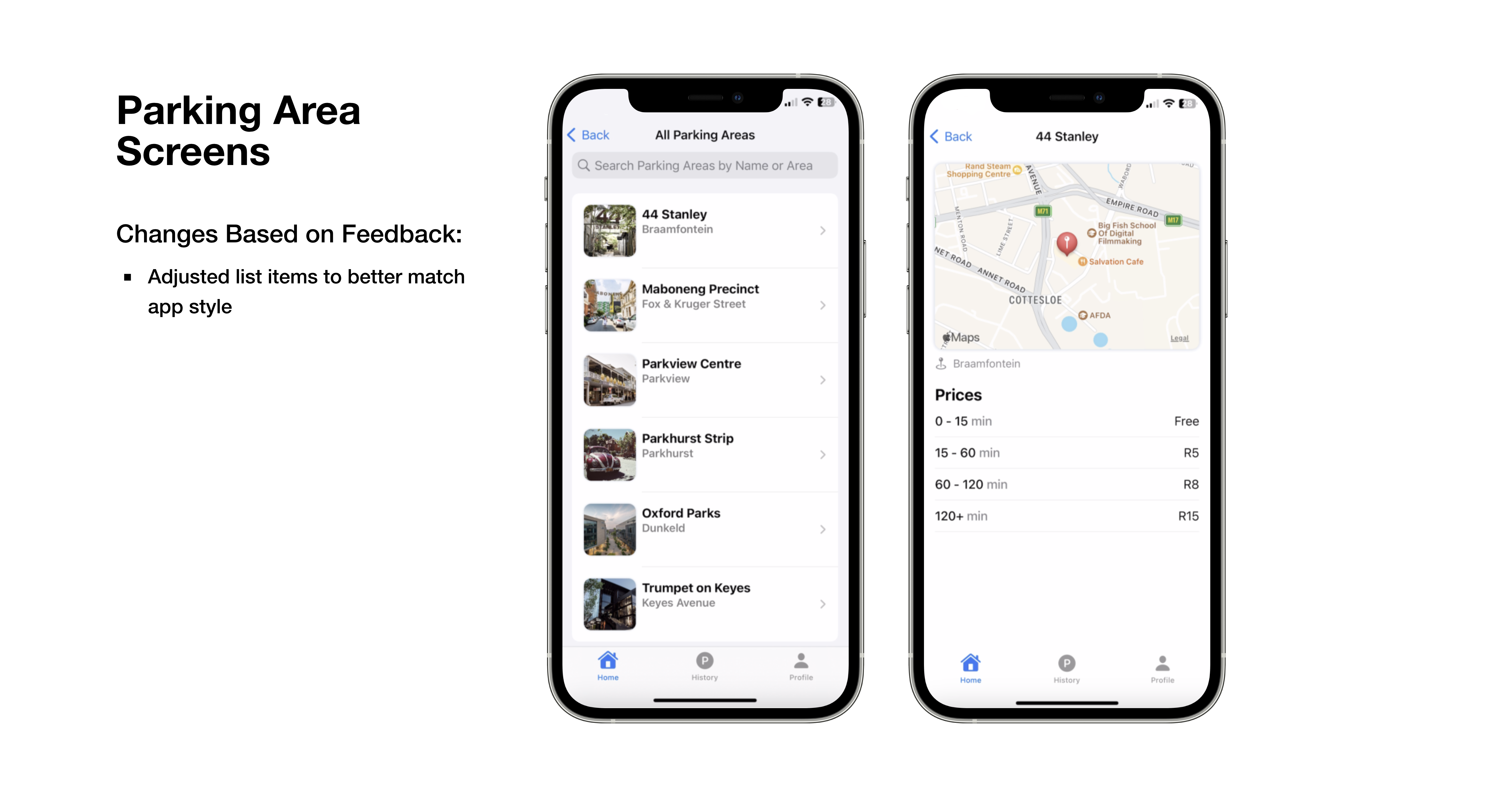
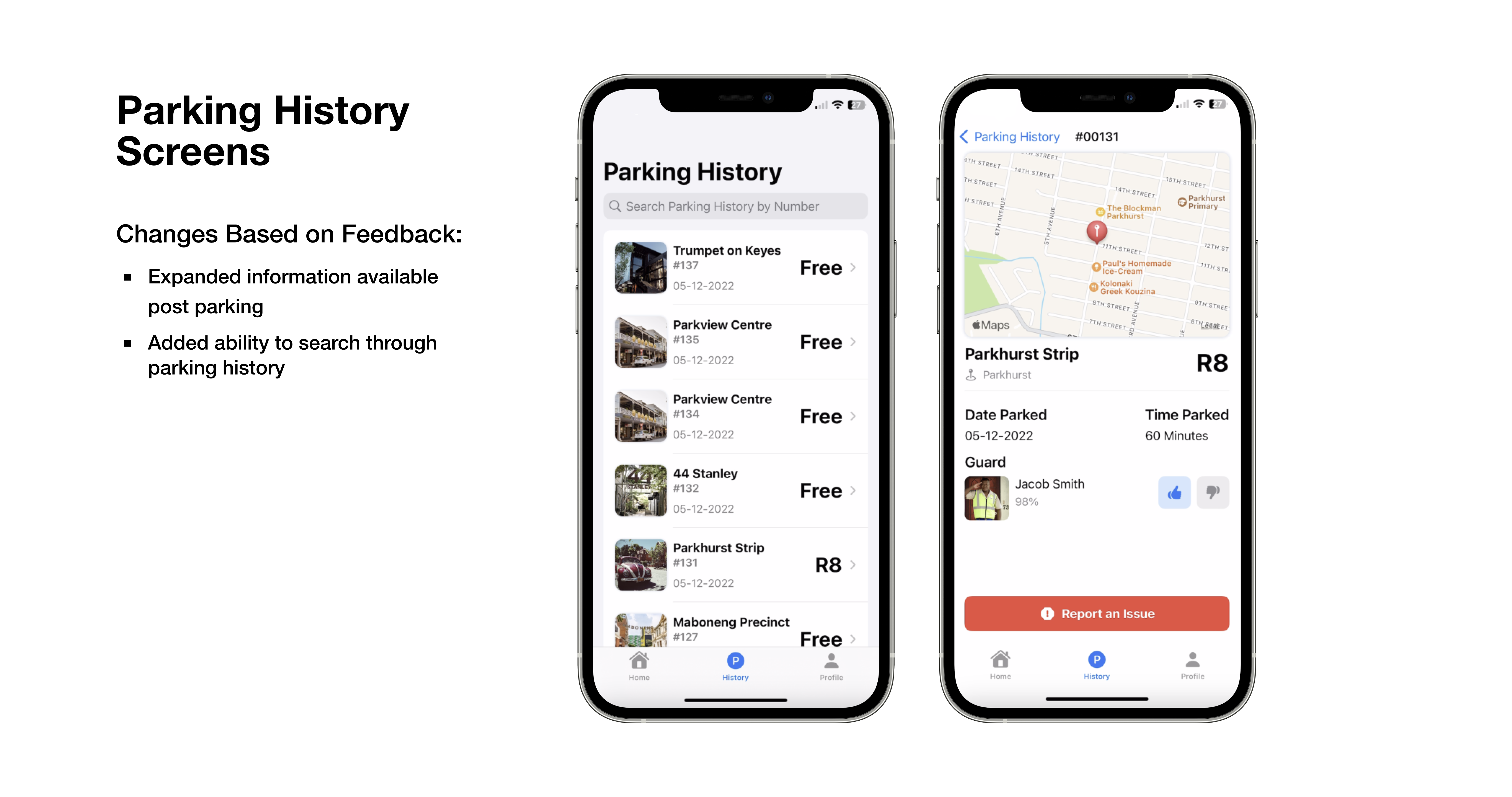
I then used these low-fidelity wireframes, along with feedback sessions to develop a set of high-fidelity wireframes. Thereafter, Swift & SwiftUI were used to turn those high-fidelity wireframes into a working prototype, which was seen in the video earlier.
✅ Deliver
User Testing
In a discounted evaluation, I made use of task-based testing, alongside a semi-structured interview to test my design solution and prototype. I conducted all of the tests with 2 participants in their mid 20s. All participants had a driver's license and were familair with the problem space. Throughout testing, I also asked users to think aloud. The task scenarios used to test this were:
- Imagine you are out and have used on-street parking. How would you check your current parking time and cost?
Rationale: The first task scenario aims to cover the primary purpose of the app, seeing if users know and understand how to perform one of its main actions. - Imagine you are have just gotten home after using on-street parking and want to rate your car guard, how would you do this?
Rationale: After completing the primary function, I wanted to test the users ability to find previous parking sessions.
Reflection & Suggestions
Overall, I believe that through the process outlined above, I was able to land on an innovative solution to a problem that is evident on a daily basis to South African drivers. While I am happy with the solution I developed, during final user testing there were a handful of suggestions given for further improvement. These include:
- Diversify User Testing Demographics: While the discounted evaluation provides valuable feedback, I should consider expanding the user testing pool to include a more diverse demographic, ensuring a broader representation of potential users. This could uncover additional insights and perspectives that may influence the final design.
- Improve Visual Design Language: While users noted the app was easy to use and presented a minimalist aesthetic, users advised designing a visual design language that was more unique and had its own brand identity.
- Integrate More Deeply with Private Security Companies: In South Africa, private security companies are extremely popular. Users would have liked to see a deeper integration with these companies when a car guard is watching their vehicle.
